Job hunting. It’s a full-time job, and standing out in a sea of resumes requires a bit of effort. You might have a lot of relevant experience, but if your resume is not eye-catching – you run the risk of getting passed up. And for those of you that are applying for the dream job without fulfilling all the required qualifications – there might be a different way to leverage what you’ve got.
The very first step in your job hunt is to create that eye-catching resume, so we’ve put together an interactive inspiration site that has 72 well-designed resumes from all around the web for you to feast your eyes on. Click on the below teaser to access it!
Check out this recruitment yield pyramid from Workable which visualizes the hiring process based on a recruitment process standard that most companies have. Say out of 240 applications, only 15 candidates were selected for a first interview. That’s around 6%!
Luckily, we’ve perused the web for expert tips and we’re putting them all together in this blog post. It’s a mix of content and design suggestions that will help you put your best foot forward. So you can make it into that 6%.
Ready to go? Let’s dive in.
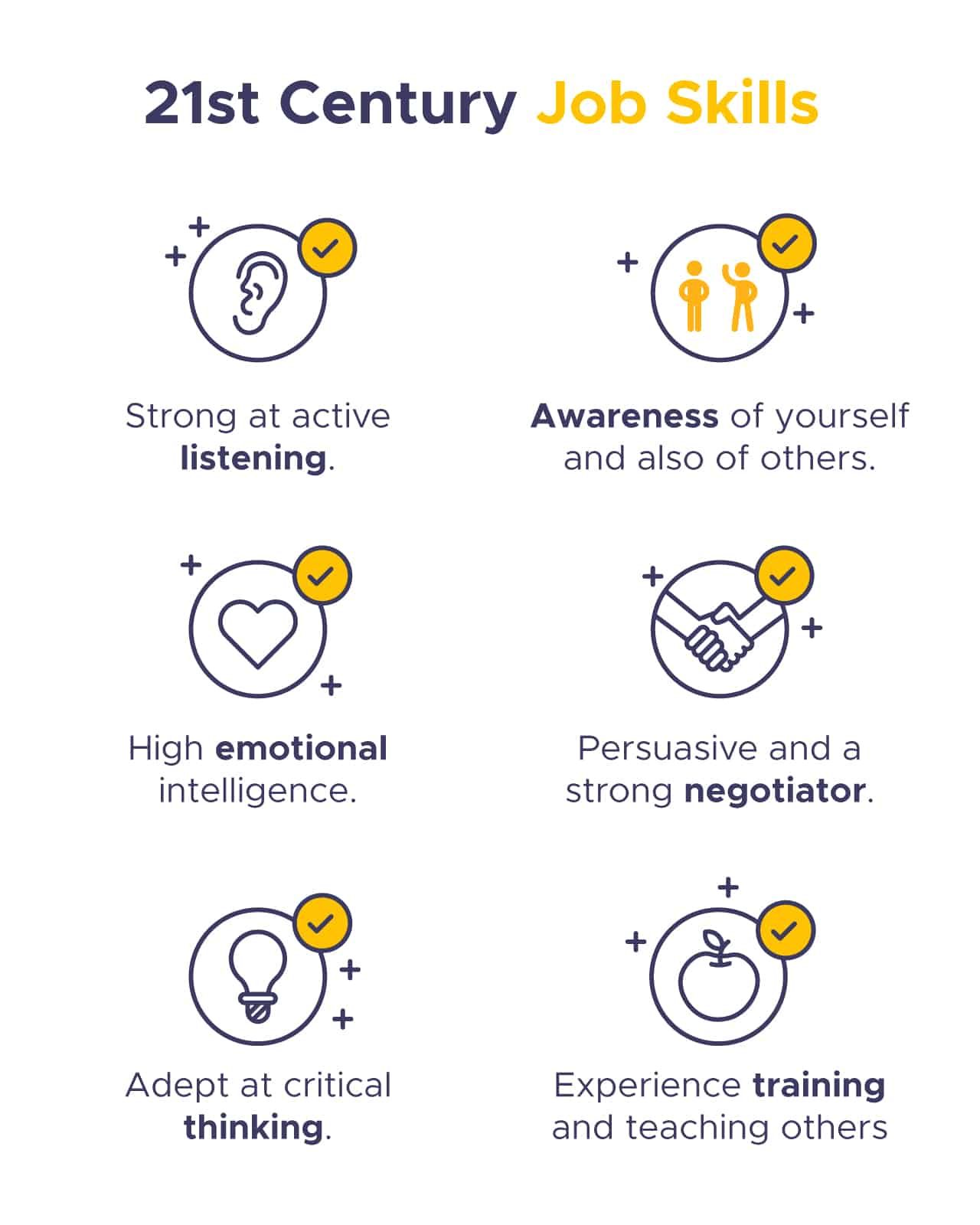
1. Make Your Job Skills As Modern As You Are
Beyond your design and coding skills, your employer also wants to know if you’ll be a cultural fit and a team player – and these depend a lot on your soft skills. We might even call these 21st-century job skills, a combination of social and process skills, and it is important to include them alongside your technical abilities.
Here is a handful that might be a good fit:
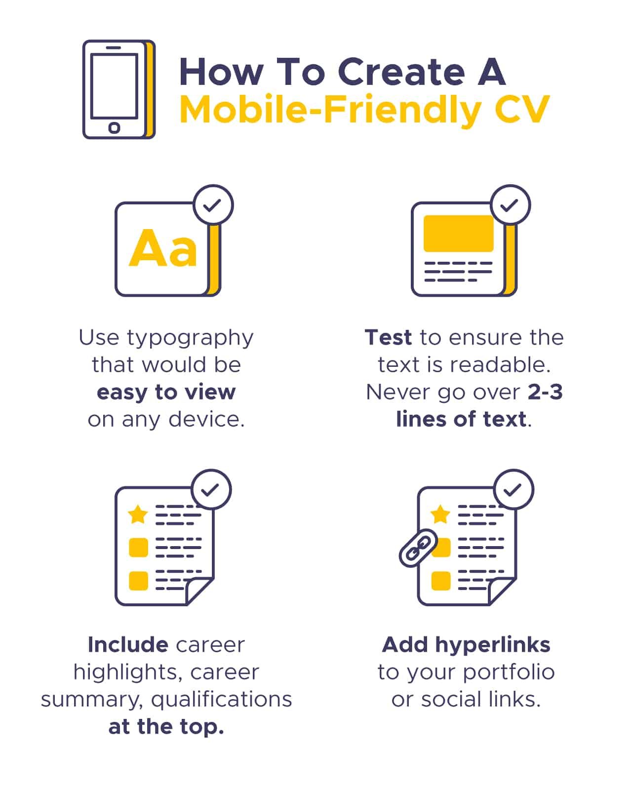
2. Make Sure Your CV Is Mobile-Friendly
While it’s worth pointing out that most headhunters out there are tapping away on LinkedIn via their laptops, you should consider that your CV and cover letter might be opened on a smartphone. And that’s where a mobile-responsive document really comes into play.
Here are four things to keep in mind when creating a mobile-friendly CV:
3. Keep In Mind Your Target Industry When Choosing Color Schemes
Of course, you won’t always be trying to create a mobile-friendly resume, especially when you’d like to get a bit creative. Color schemes are a great way to create a certain kind of mood in your resume, which could attract the attention of the right HR manager.
One way to do this is to match your resume’s color scheme to the industry that you’re looking to be a part of. For instance, if you are applying for a role in more conservative industries such as banking or law, you might want to go with black or darker tones to show you mean business.
If you’re applying to a creative agency or a tech startup, you’ll have a lot more flexibility in terms of the color schemes you can use. Don’t be afraid to go bright to attract eyeballs. If you really want to go above and beyond, you might be able to use the color scheme of a company that has a more open culture.
See the below GIF for the color scheme possibilities within Piktochart. You can either select from our available color schemes or create your own.
4. Use Your Resume To Tell A Story
To really capture the attention of your audience, whether it’s a recruiter, hiring manager, or your future boss, you’ll benefit from telling a story with your resume. And believe it or not, you’ll actually be able to use storytelling tactics that are old as time to do this.
Here are a handful of storytelling tips that apply very well to resume writing:
- Include characters – you are the star of the show, but remember to include your boss, customers, employees, and co-workers. Be clear about how your role operated with them – who did you report to? How many people did you manage?
- Don’t forget the setting – Could be the company you’ve worked for but also the division, department, region, or team. This gives context, but can also show things such as international experience.
- Make sure your resume has a plot – Perhaps all the odds were against you but you solved the problem and achieved success (dragon slaying). Or you worked with others to achieve a major goal while overcoming challenges along the way (the hero’s quest).
- Don’t skimp on the conflict – Giving context to the conflict you’ve faced in your career shows growth and initiative. Did you redesign an inefficient process or reverse declining sales? Make sure you talk about it!
Immanuel, our former content specialist told a story by creating an interactive application that was sleek, fun, and well-designed (you can view it in full here).
5. Give A Design Nod To Your Line Of Work
Consider your resume as an extension of yourself and the work that you do. So why not use design elements that will give a nod to your profession?
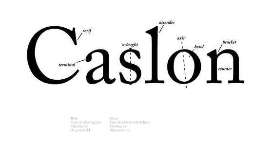
For example, if you work in the publishing industry – you should try to give your resume a “bookish” vibe which can be accomplished by:
- Structuring your resume layout to look like a book page
- Using classic typography such as Caslon
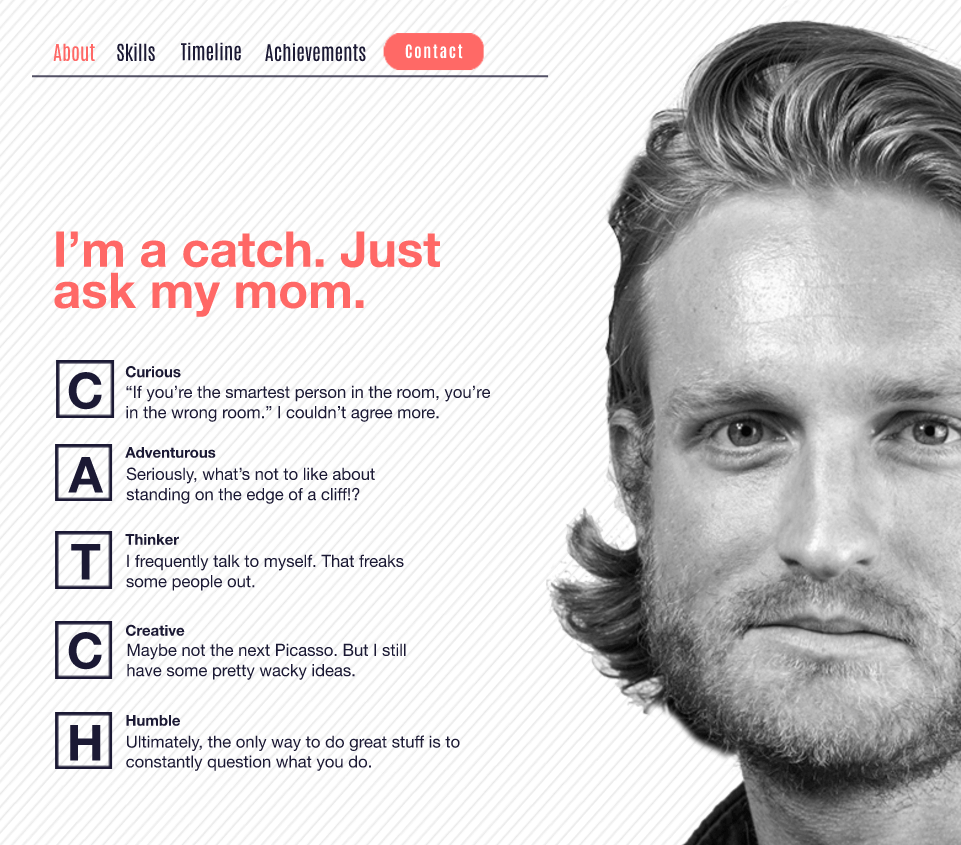
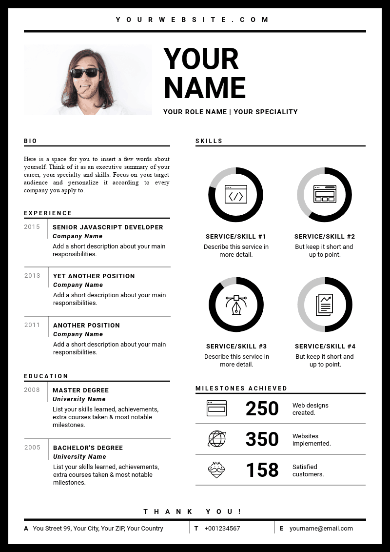
Or, if you work as a web designer – you could try to use your resume to emulate a beautifully-designed web page, complete with digital elements. See below for an example.
6. Use Your Resume as a Personal Branding Document
For those unfamiliar, a personal brand is a way of marketing yourself through some avenues – which is usually done by crafting a cohesive persona through social media accounts and a website. The idea here is to create an online identity that helps you put your best foot forward, especially when it comes to landing professional opportunities.
So why can’t your resume also be a part of your personal branding strategy? Here are a handful of tips that you can use to build a personal brand through your resume.
- Create a personal logo for yourself using a symbol or even just your initials.
See Aaron Johnson’s personal branding logo in the below image.
- Consistency is key – make sure that you set rules for the layout of your resume, whether it’s in font choice, text sizing, or alignment.
- Choose a color scheme that reflects your brand.
For example, Matteo in the below example is using bright colors such as yellow and orange as a part of his personal brand as an illustrator and designer.
7. Use Design That’s Right on Top of the Trends
If you are applying for jobs in creative roles, you will be competing with a sea of candidates that will be thinking out of the box when it comes to their application.
To stay with or ahead of the pack, you should consider designing your resume in a way that is right on trend to avoid looking outdated.
For instance, flat design is currently right on-trend with websites and apps and will communicate to hiring managers that you are on top of your design game.
Below is an example of using flat design in a CV.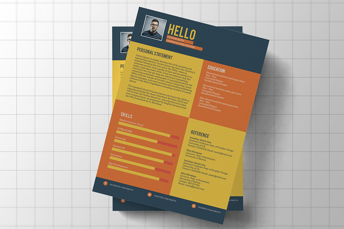
8. Choose the Right Font for Your Resume
While you want to make sure your resume is legible, you also want to stand out while everyone else is playing safe with the likes of Arial or Times New Roman. The right font can help you stand out, and also keep eyeballs from bouncing away from your resume.
So what should you keep in mind when selecting a font?
- Keep your font sizes between 11 and 13 points – you want a happy balance between being able to fit enough items into your resume, while still being legible.
- Keep font sizes consistent – headers should be all the same size for example.
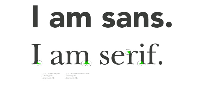
- Serif fonts work well for digital fields or roles that involve creative work, while sans serif fonts are a better fit for more conservative industries. This is because serif fonts generally have an extra design and stroke embellishment at the end of letters, while serif fonts keep it simple.
9. Emphasize Your Contact Info Section Visually
It is widely known, and a sad fact, that recruiters apparently spend just six measly seconds reviewing your resume. To make sure that your resume gets picked out of the crowd, and keeping those six seconds in mind, why not place a lot of visual emphasis on your contact information section?
Here are some things you can do to make your contact info section stand out:
- Use icons to add live links to your social media, email address, and portfolio.
- Use white space to draw the recruiter’s eye into your contact information.
- Use color – you can change the color of the text itself, or create a new background color just for your contact info section.
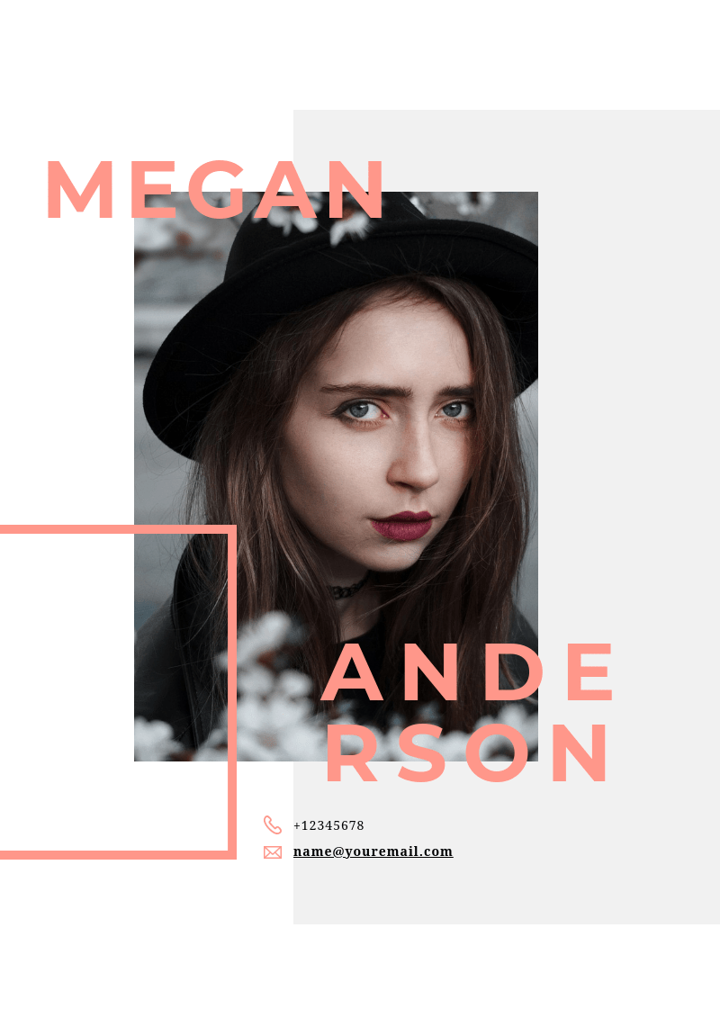
See the below example where Paolo Pettigiani uses a pop of color and white space for his contact info page.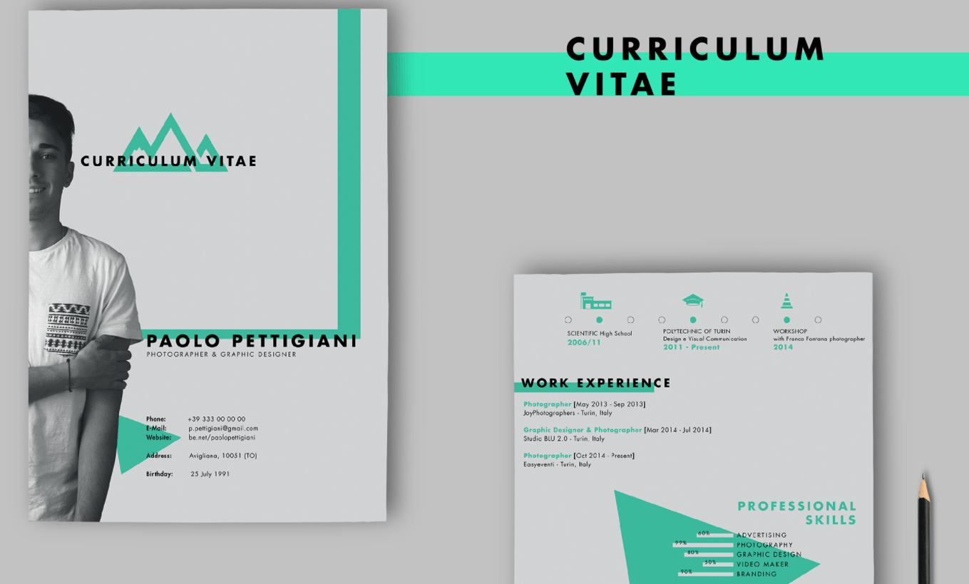
10. Make Your Content As Skimmable As Possible
Again, not to remind you of the brevity that is the recruiter’s first interaction with your resume, but you have just six seconds to impress. This means that you should make your content as easy as possible to skim through – so that readers should be able to pick up your strengths and essential information as quickly as possible.
Here are a few ways to make your resume skimmable:
- Use columns to organize those resumes that are bursting at the seams with info. You can also experiment with using columns that are of different sizes.
- Format your content by using headings, subheadings, bullet points, and white space.
- Try using an infographic – help those text-weary recruiters by using visuals instead
See the below example of Martin Suster’s infographic resume.
11. Make Your Resume Printable
Despite dressing up your resume with a handful of design elements, visuals, and colors, it would be a good idea to make your resume printable. A printable resume is important for those interviewers that like to avoid using their laptops during the interview.
There remains an interesting point that your resume should be as user-centered as possible, and creating the ability to print is one way to focus on the UX of your resume. Here are a few things you should do to ensure your resume is printable:
- Keep in mind that your resume may be printed in black and white.
- Use a legible font. 11 to 13 points will work.
- Minimize the number of pages of your resume – 1 to 2 pages is fine, but 15 is not.
- Having a personal branded logo on your resume is a nice touch, but make sure your name is still on it.
- Send your printable resume in PDF form.
See the below example for inspiration – yes, it is still possible to make your resume visually appealing while making it also printable.
12. Use Fun Design Elements in Moderation
While design elements such as flat icons, images, and bright colors could help your resume stand out from the pack – using too many can cause a visual overload in the viewer and could actually distract from the actual purpose of the resume.
To avoid using an overwhelming amount of design elements, here are a handful of tips to be mindful of:
- Use only a small handful of colors, as too many can be distracting (learn more by reading articles from our color design series here).
- Work with the basic shapes that can be found within your word processor.
- Consider using graphic lines to add personality.
See the below example which uses just one color and graphic line to create a neat and organized resume.
13. Consider Your Layout
The layout is an important factor when putting your resume together. Whether you’re after a role at a creative agency or a bank, keeping your resume organized and tidy should be your number one priority.
Here are a handful of things to consider when it comes to your resume layout:
- Think about alignment when filling in your job duties. All your headers and bullet points should line up, otherwise, it creates a very confusing visual experience.
- Try using text boxes, which you’ll be able to easily drag and drop around your resume page – making layout creation a lot easier.
- Keep your audience in mind while thinking outside of the box if possible. While traditional roles will expect a fairly standard resume, jobs in creative fields will allow you to roll up your sleeves a bit more.
See the below landscape layout. It’s different and could help you stand out in a sea of portrait resumes.
14. Think About Hierarchy
Another element to consider when putting together your resume is a hierarchy. The general rule here is that the most important information in your resume should go towards the top, with the more non-essential information at the bottom.
When it comes to hierarchy, here are a few things to take note of:
- Create a profile at the top of the resume, under your contact information, which summarizes your background, skills (technical/soft), and where your expertise lies.
- If you have a lot of work experience, create two sections for your list of past and current jobs and projects. Label one “relevant experience” which pertains to the job you are applying for, and one that is “work experience” which will house the remainder of your roles.
- Also worth considering is where you place your “education” section. If you are a fresh grad (bachelors, masters, or PhD. even), you definitely want to put your education near the top of your resume. If your work experience carries more weight, then you can keep your education near the end.
See the below resume for an example of a clear and succinct profile, along with a visualization of the level of technical skill.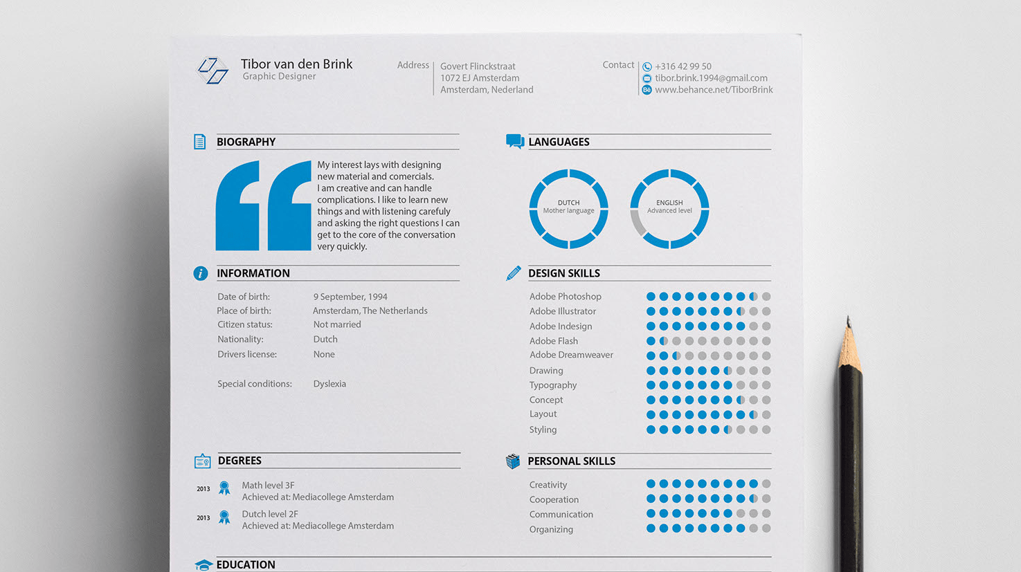
15. Last But Not Least, Mind Your Structure
If you think of your resume as something to be built, then you’ll understand the importance of structure. A great way to approach structuring your resume is by using a “grid structure,” which introduces columns, rows, visual dividers, and white space. This keeps all the data that you’re presenting organized and makes skimming a lot easier.
See the below resume, organized in a grid structure, as an example.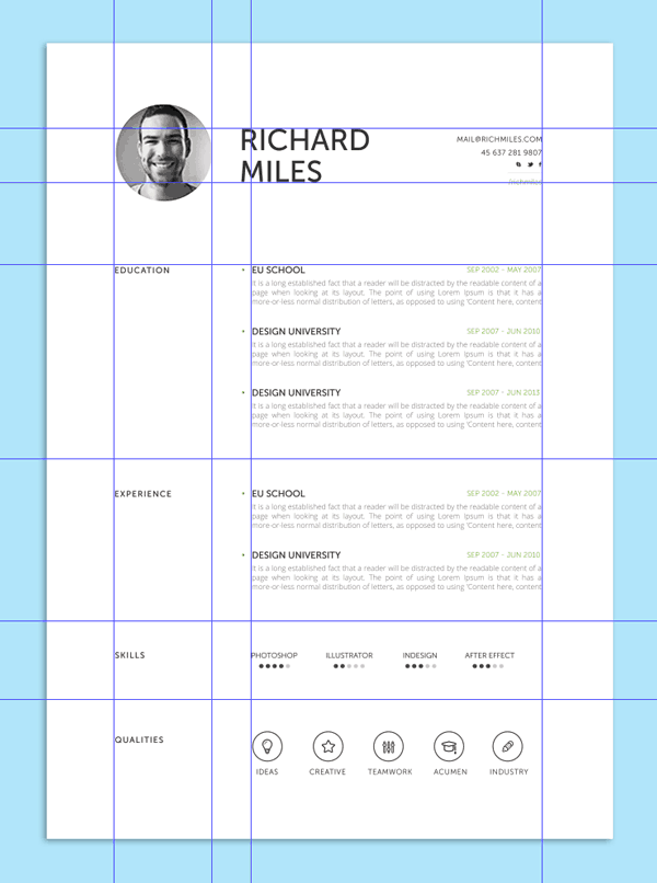
Time To Make Your Own!
Now that you’re an up-and-coming expert in resume writing, it’s time to apply this new knowledge to your very own CV. Our designers have created a batch of templates to help you put your best foot forward when it comes to applying for your next job. Whether you’re a marketer, data scientist, or financial analyst – we’ve got the template for you!
But first, don’t forget to create a Piktochart account (it’s free) so that you can easily customize the templates below.
01. Marketing CV

Edit this template in Piktochart now!
02. Social Media CV
Edit this template in Piktochart now!
03. General CV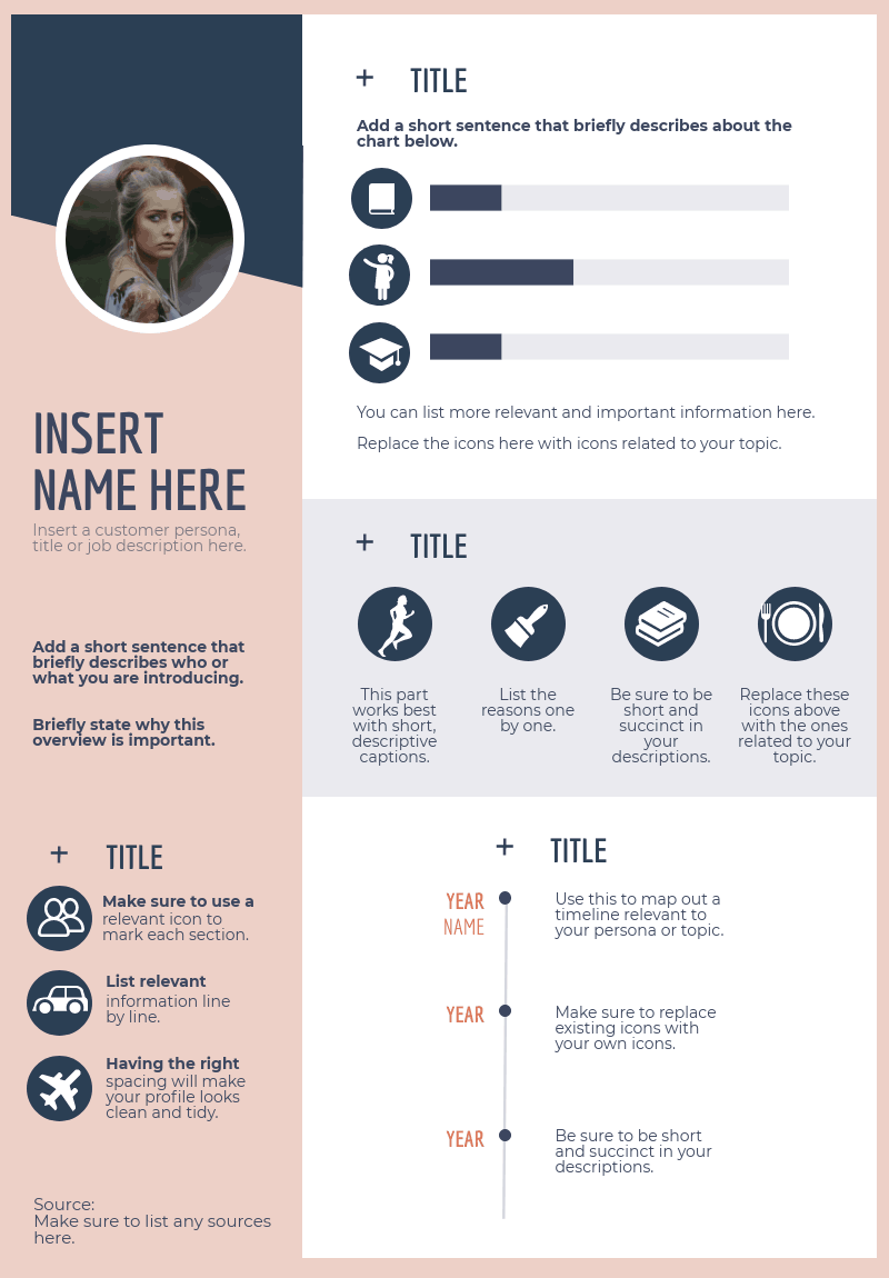
Edit this template in Piktochart now!
04. Creative CV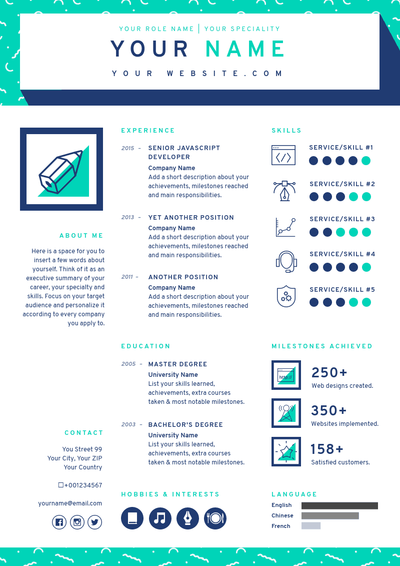
Edit this template in Piktochart now!
05. Writer CV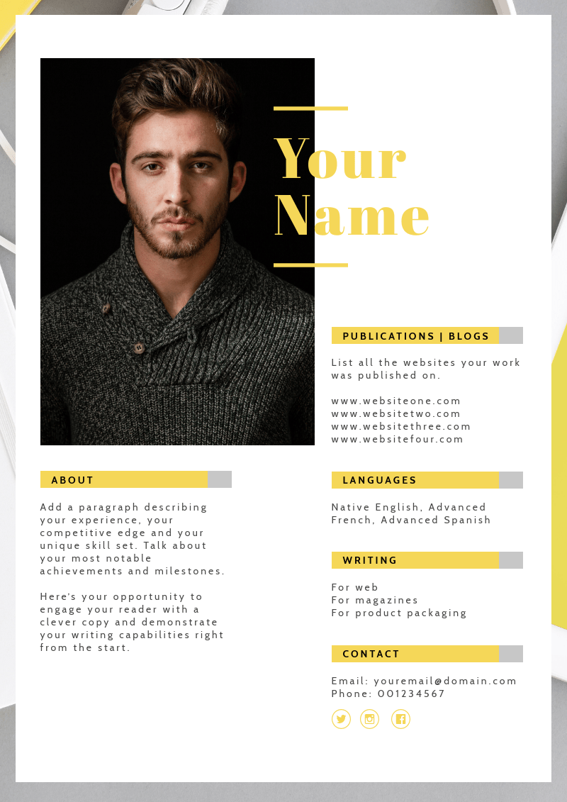
Edit this template in Piktochart now!
06. Personal Branding Poster

Edit this template in Piktochart now!
07. Creative CV 2
Edit this template in Piktochart now!
08. Email Marketer CV
See the full template and edit it in Piktochart now!
09. Financial Analyst CV
Edit this template in Piktochart now!
